Websites today are used by everyone from business to small scale productions to artists. This means that with more and more websites, it becomes imperative that your website stands apart from the others. With the number of websites increasing with each passing day, it has become harder and harder to make sure that your website receives the maximum traffic and is the most interactive.
Here are seven simple ways to ensure that your website looks good:
1. The design of the website should be balanced.
While designing your website you must ensure that your design does not look lopsided wherein it would bend more to one of the sides. Symmetry is key to making a visually sound webpage. A well-designed website will be one with a balance visible to everyone who visits it.
2. Try to make the graphics go well together.
Do you always need fancy graphics to make your website look visually appealing? The answer is a clear no. What you need to ensure is that the graphics you do use go well together and do not seem out of place.
3. Pick two or three base colors at most for your design.
While designing your website you must keep in mind that some designs go well together while others look terrible together. Understanding that is the first step to selecting a perfect colour palette for your website. Don’t make it a flurry of colours that look abhorrent together.
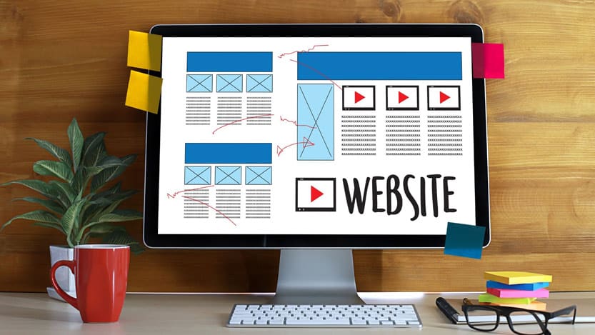
4. Make sure you compartmentalize your design by using grids.
Grids ensure that your design is balanced. They are basically a series of vertical and horizontal rulers that will enable you to compartmentalize your design. Making sure that you compartmentalize your design by using grids will make your website structured adding to its aesthetics.
5. Make essentials noticeable by including white area around them.
More often than not, many would clutter their websites with lots of elements. This is a futile activity as the clutter shall make your webpage nothing but unappealing. Make sure you add white space around your elements.
6. Improve your website’s typography.
While this is a never-ending subject and much more can be said about how one can ensure that your website’s topography is the key to a balanced design. You must ensure that you find the right solution for yourself that resonates with your vision.
7. Have all elements connected.
Once you’ve ensured the above steps make sure you check for the final time that all your elements are well connected and look coherent.
If you wish to achieve more and more viewership on your website and want assistance to reach this goal, contact SPARK Services now! We are committed to providing the solutions tailored to the needs and requirements of our clients to ensure that they get exactly what they dreamt of while conceptualizing their websites.
With our headquarters in Muskogee, Oklahoma, SPARK Services will ensure that we assist you with a team of experts devoted to ensuring that you receive the best experience.


